Key Elements of High-Converting Landing Pages
Creating high-converting landing pages involves several key elements that can significantly boost user engagement and conversion rates. First and foremost, the headline must be compelling and clear, instantly conveying the value proposition to the visitor. In addition, the use of persuasive subheadings can help to guide the reader's attention and reinforce the main message. Incorporating call-to-action (CTA) buttons prominently within the design is crucial; these should be visually distinct and action-oriented, such as 'Get Started' or 'Claim Your Offer'.
Another vital aspect of high-converting landing pages is the inclusion of trust signals such as testimonials, star ratings, or security badges. These elements can significantly reduce anxiety and bolster credibility, reassuring visitors about the quality and reliability of the offer. Additionally, a visually appealing layout, complemented by optimized images or videos, can enhance engagement and retention. Finally, it is essential to maintain a streamlined form for lead capture—keeping it simple and asking only for critical information will help minimize friction and encourage conversions.
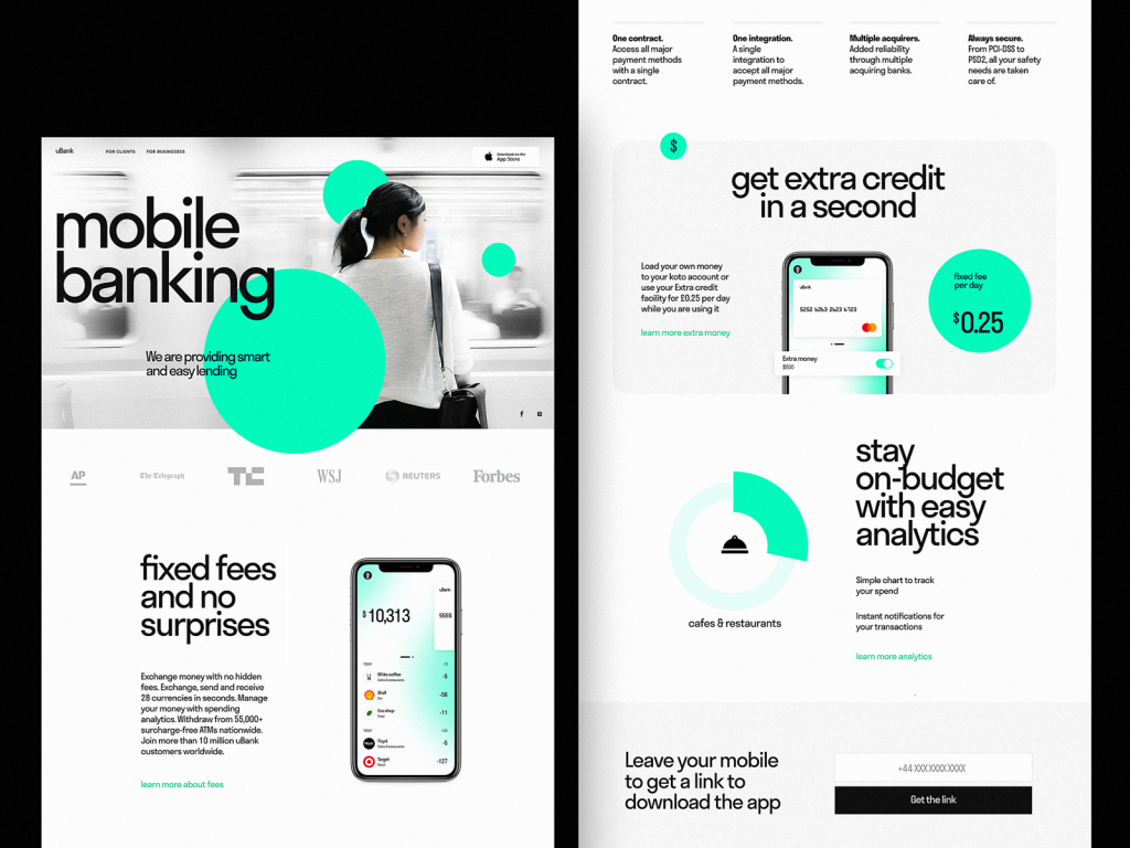
10 Landing Page Examples That Captured Attention
Landing pages play a crucial role in capturing visitor attention and converting them into leads or customers. When designed effectively, these pages can highlight a product or service's unique selling proposition, making a lasting impression on potential clients. Here are 10 landing page examples that successfully captured attention:
- Airbnb: Their landing page showcases stunning visuals with a clear call-to-action, enticing users to explore properties.
- Dropbox: Featuring a minimalist design, Dropbox uses an appealing value proposition and easy navigation that guides users effortlessly.
- Shopify: With engaging testimonials and vibrant design, Shopify’s landing page instantly builds trust and piques curiosity.
- Evernote: This example utilizes a compelling headline and concise description, laying out the app's benefits front and center.
- Slack: Slack captures attention with its friendly tone, vibrant colors, and clear explanation of its communication solutions.
- Instapage: Their landing page promotes its own services with powerful imagery coupled with a persuasive copy that emphasizes conversion.
- TurboTax: By focusing on user pain points, TurboTax's landing page resolves concerns while highlighting its easy-to-use interface.
- Unbounce: Effective use of testimonials and detailed explanations contributes to Unbounce’s landing page's effectiveness in converting visitors.
- Leadpages: By employing a strong call-to-action and an intuitive layout, Leadpages clearly defines its purpose and encourages interested customers.
- Basecamp: They utilize a straightforward approach with a focus on real-user feedback to captivate potential users.
How to Create a Landing Page That Increases Conversion Rates
Creating a landing page that increases conversion rates begins with understanding your audience. Start by defining their needs and pain points, which will guide your content and design choices. A compelling headline is crucial; it should clearly convey the value proposition of your offer. Use engaging visuals and concise copy to capture attention, and make sure your call-to-action (CTA) is prominent. Consider incorporating trust signals, such as customer testimonials or statistics, to alleviate any hesitation visitors might have.
Next, optimize the layout of your landing page for user experience. Keep it simple and focused, eliminating any unnecessary distractions that might divert attention from your primary goal. Use bullet points or numbered lists to present key benefits clearly. Ensure that your CTA stands out, whether through contrasting colors or strategic placement on the page. By continuously A/B testing different elements, such as headlines, images, and CTA buttons, you can refine your approach and ultimately craft a landing page that drives higher conversion rates.