5 Signs It's Time to Refresh Your Mobile Website Design
In the fast-paced digital world, ensuring your mobile website design remains contemporary is crucial for user engagement. Here are 5 signs that indicate it might be time to refresh your mobile website design:
- High Bounce Rate: If you notice an increase in your bounce rate on mobile devices, it could signal that your design is not user-friendly.
- Outdated Aesthetics: A design that feels outdated can deter users. If your site looks like it's from a past decade, it's time for a makeover.
- Slow Loading Times: With mobile users expecting instant access, a slow website can lead to frustration. Refreshing your design may involve optimizing images and streamlining coding.
- Lack of Responsiveness: If your website does not look good on various screen sizes, it’s imperative to consider a redesign that accommodates all devices.
- Changes in Branding: If your branding has evolved, your mobile site should reflect this to maintain consistency and foster brand recognition.
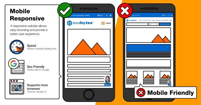
The Importance of Responsive Design: Is Your Website Fashionably Fit?
In today's digital landscape, having a website that looks great on all devices is not just a luxury; it's a necessity. Responsive design ensures that your website adapts seamlessly to different screen sizes, from desktop monitors to mobile phones. This adaptability not only enhances user experience but also plays a critical role in search engine optimization (SEO). Google prioritizes websites that provide a consistent experience across devices, so if your site isn't fashionably fit for all screens, you risk losing valuable traffic and rankings.
When evaluating your website's responsive design, consider the following key components:
- Layout: Ensure that your content flows naturally on any screen size.
- Images: Use flexible images that resize and adapt without losing quality.
- Navigation: Implement a user-friendly menu that is easy to access no matter the device.
How a Mobile-Friendly Makeover Can Boost Your Website's Performance
In today's digital landscape, a mobile-friendly makeover is not just an option but a necessity for any website looking to thrive. With over half of global internet traffic coming from mobile devices, it's crucial that your site is optimized for a seamless mobile experience. A well-executed mobile redesign can lead to improved loading speeds, easier navigation, and ultimately higher user engagement. When users can access your content quickly and without frustration, they are much more likely to stay on your site, explore further, and convert.
Furthermore, search engines like Google prioritize mobile-friendly websites in their rankings. This means that a mobile-responsive design can significantly increase your visibility in search results, driving more organic traffic to your site. To achieve a successful makeover, consider implementing responsive design, optimizing images, and ensuring that buttons and links are easily tappable on smaller screens. By investing in a mobile-friendly approach, you're not only enhancing user experience but also positioning your website for greater success in today’s competitive online environment.